Don't reinvent the scrollbar
We don’t need page numbers on the web, you can scroll your way through a piece of text at the flick of a finger. But how do you know how far through an article you are?
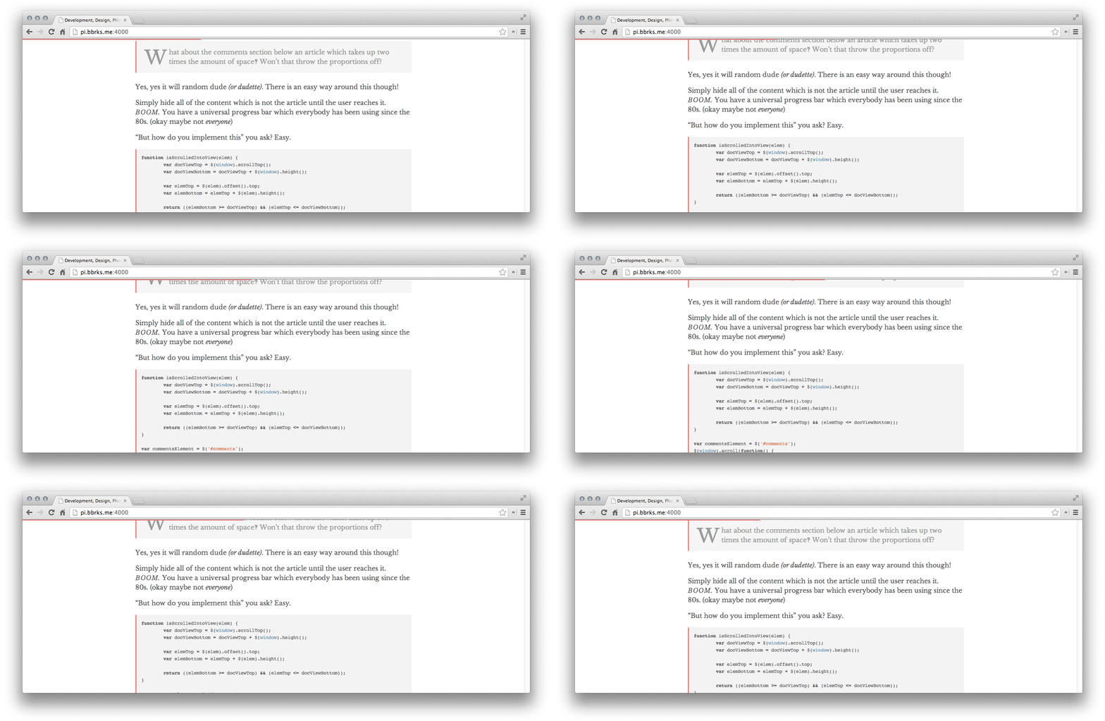
I came across a discussion or two on Hacker News today about making indicators to display your progress while reading an article. A concept that looked a little like this…

Kindles and other E-Book readers have something similar. A horizontal bar along the bottom of the screen which displays how far through a book you are, along with chapter markers.

The idea of websites having this feature is nice, but it does not translate well. The reading progress bar is horizontal, while the article you are reading is (presumably) vertical. This has poor [natural mapping][naturalmapping]. You scroll down through article contents to move the indicator bar across. It just doesn’t make sense. [naturalmapping]: http://en.wikipedia.org/wiki/Natural_mapping_(interface_design)
It happens to feel right with an e-reader, because you have defined pages, even if the content does reflow based on typography settings. You don’t scroll vertically through a book on them. The page turns are horizontal, and thus horizontal progress indicators make sense & have good natural mapping.
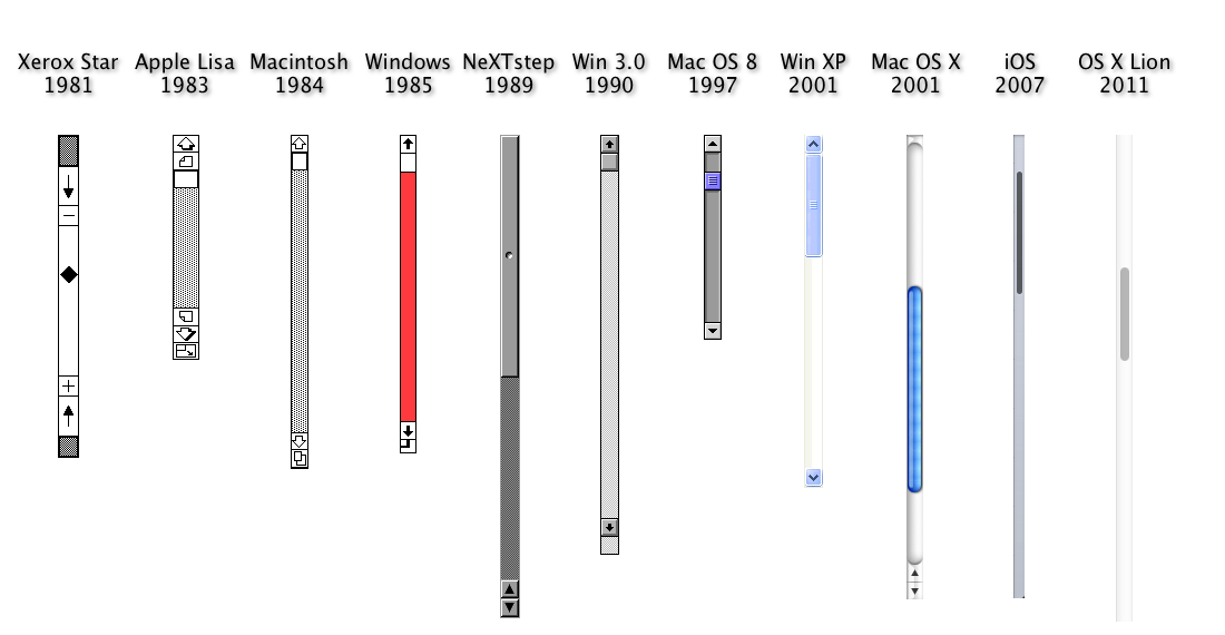
You might be surprised to learn that we already have an OS-native, and cross-platform progress bar for the web. One that has been around for much longer than the web has existed, and one that you likely use every day without a second thought. It’s called the scroll bar, you may have heard of it.

Scrollbars are used not only to progress through content, but can identify size of content, and also just serve as a visual indicator without interaction, much like the animated example at the top of this article.
Relying on scrollbars to visualise progress of an article does however have some caveats. Things like comments, adverts, multi-page articles have tainted the scrollbar’s usefulness as a progress indicator.
The proportion of article to comments can be corrected however…
Simply hide all of the content which is not the article until the user reaches it! You now have a universal progress bar which everybody has been using since the 80s.
Gianni Chiappetta has kindly written a jQuery plugin for us to use :)
@bbrks_ Aaaaaaand plugin-ified: http://t.co/K2AOE2NLeh
— Gianni Chiappetta (@gf3) August 21, 2013
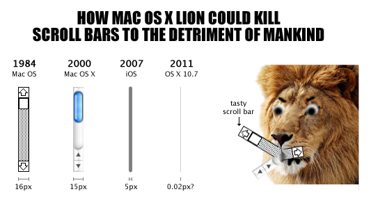
Another caveat is that Apple in their glorious wisdom and courage have forgone displaying scrollbars by default.

One alternative is to ignore iOS and OS X users. But that’s not very nice. There are many scrolling libraries you can use to provide a non-native scrollbar, however these break native behaviour, and annoy many users.
… Or you can just make your own indicator like the one seen at the very start of the article! Just don’t use a horizontal indicator for vertical progression :)
"But what happens when the article is split across several pages?"
Well then you’ve probably got bigger problems. An article shouldn’t be split across multiple pages on the web! We have an infinitely long canvas to write on, along with an elegant way of moving through it. Why would you need to split it up?
"But ad revenue!"
Maybe there are better ways of monetising than forcing multiple pages of ads down your users throats? :)